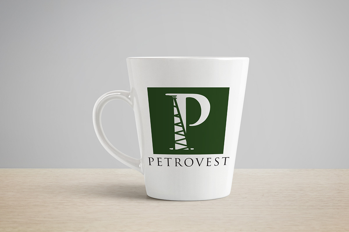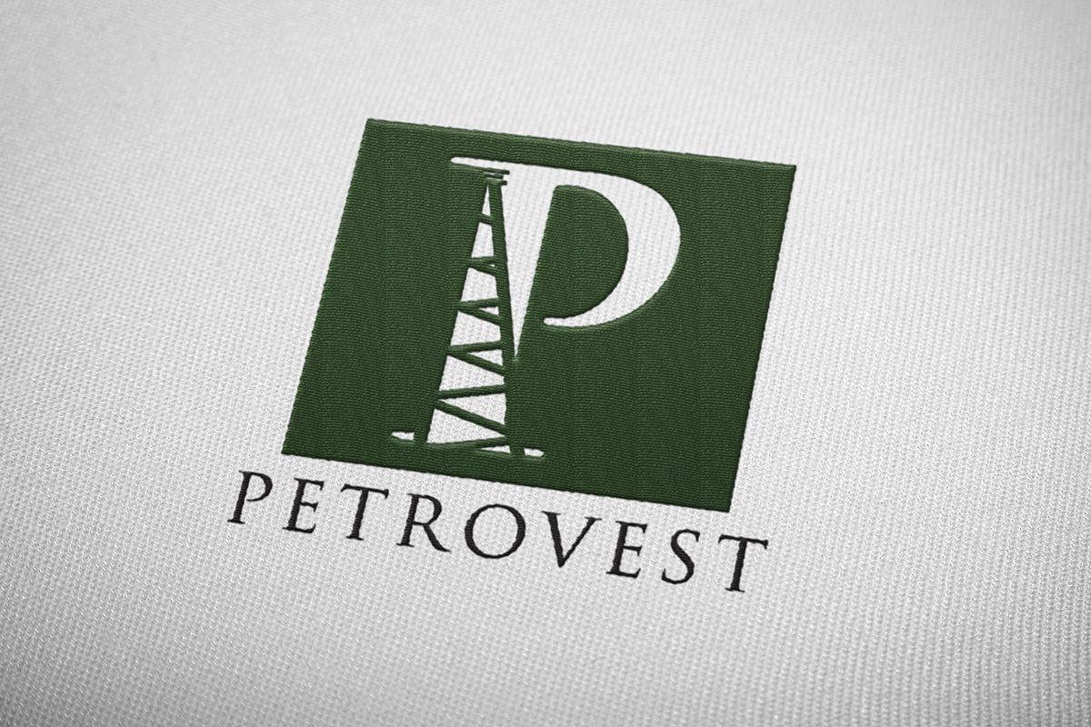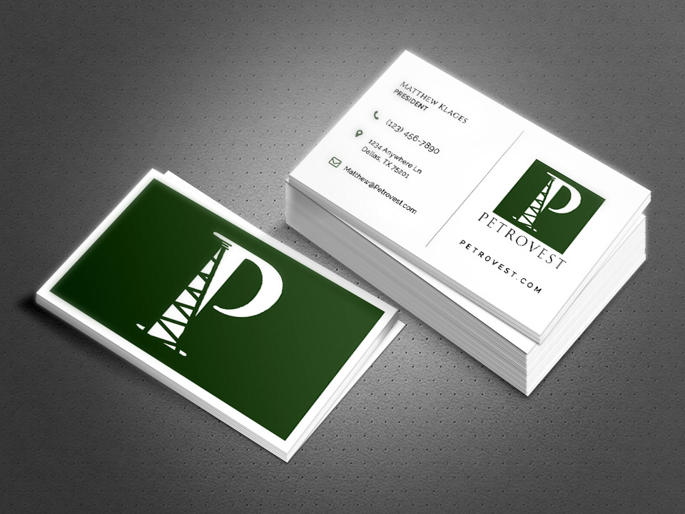
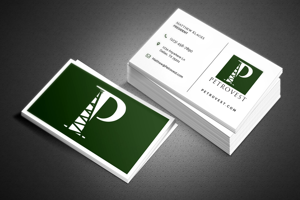
As an oil & gas acquisitions company, PetroVest needed a logo that conveyed their market, yet remained simple and elegant. The resulting design used an understated serif "P" with simple diagonal lines to impart the look of an oil derrick.
Client:
PetroVest
Date:
July 2017
Task:
Logo Design